
Success Stories
GlobalMed Source
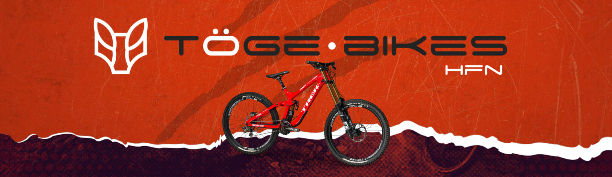
Creating a Striking Brand Identity

Toge Bikes, a cycling store, stood out in a competitive market through a meticulous branding process. This included creating a logo and a color palette that reflected their passion for cycling, along with an identity manual that conveyed their commitment to quality and sports. These elements were implemented across digital platforms and printed materials.


Brand Etymology
The meaning of ‘Toge’ comes from two fundamental cultures: From Otomi, which means ‘One who rides a beast,’ and from Japanese: ‘Mountain pass and other winding paths.’
The Logo Inspiration
Toge Bikes’ logo incorporates the figure of ‘El Cadejo,’ a mythological creature found in the folklore of various Central and South American cultures. In some versions of the legend, El Cadejo is depicted as a giant white dog that protects people from nighttime dangers.
This choice not only enriches the brand’s identity but also connects with tradition and safety, essential values for cycling enthusiasts.
The Result
Toge Bikes has not only become a recognized name in the world of cycling but has also built a strong and professional identity that speaks to its passion for the sport and commitment to quality. Their achievement lies in their strategic focus on branding, which has attracted a broader audience and propelled their success in a highly competitive market.